Instashop
Fresh, high quality, food delivered to your door
Backstory
As a final project with DesignLab, I was tasked with creating a solution for busy professionals that would make grocery shopping easier and less time consuming, as part of a business effort by a fictitious brick & mortar chain to regain lost business to online shopping.
Discovery
Research Goals & Questions
- Who is our target demographic?
- What are their shopping habits?
- How do they view grocery shopping?
- Who are our competitors in the market?
- In what ways should our service be similar or different than the competition?
Methods
-
User Interviews
-
Persona Development
-
User Stories
-
Competitive Analysis
Findings & Synthesis
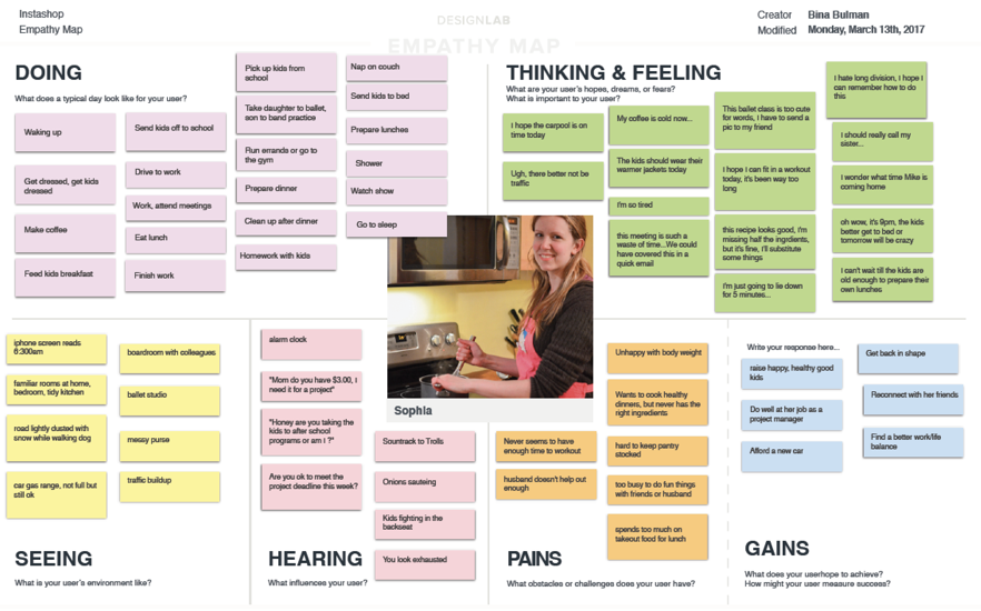
User Interviews
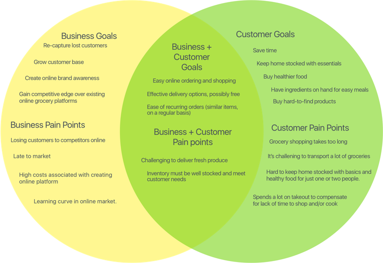
Speaking with target users, we learned that most people don’t mind grocery shopping per se, but the time it takes, and the hassle of loading and unloading groceries is something they would rather avoid. Users are concerned about the quality of produce if they’re not the ones selecting it. People are becoming increasingly health conscious and most said they get satisfaction out of knowing they’re buying the best quality food to feed their families/selves.
Market Research
There is a lot of competition in the market for grocery services, but there is still room for new life, as evidenced by the fact that all users we spoke to are still relying on brick and mortar shops. While service design/marketing are beyond the scope of this project, knowing the hesitation users have with online grocery shopping means we’ll need to ensure the design and UI are easy to use, and incorporate messaging to address their concerns.
Concept Development
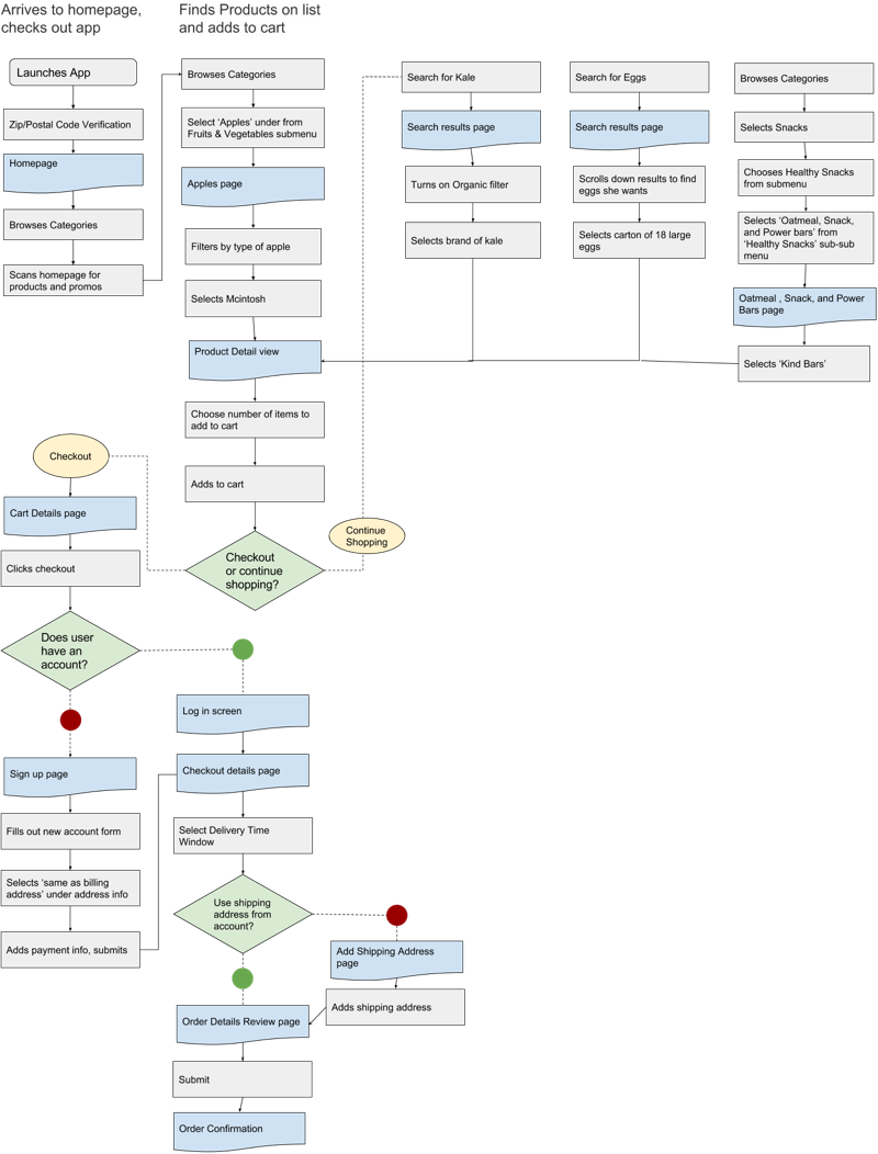
Mapping out user flows and task flows helped drive the wireframe and prototyping phase, while card sorting helped us formulate the categories and site architecture. Search will be a key navigation component as will surfacing top-level categories and the ability to save lists and favourite items.
Usability Testing
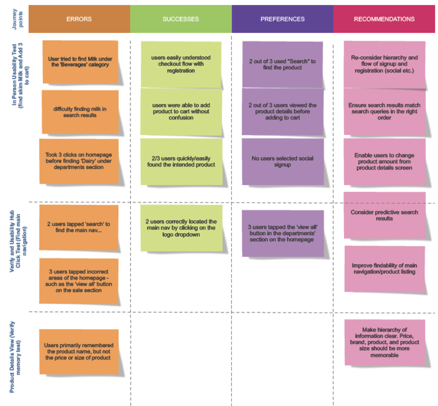
After completing a working prototype with the onboarding flow as well as the data formatting, we ran in-person usability tests, using the think-aloud method, wherein participants were given a series of tasks, and asked to think verbalize their thoughts while testing. The results showed a few common stumbling blocks and confusing points for the users, in particular around the search UI, and the accessibility of the navigation.
Running further tests (5 second memory, click tests) helped us refine the UI. We also re-examined the category matrix after finding users had difficulty finding certain products.
To reduce onboarding friction, we chose to make account creation an option step, and one that users would only be faced with on checkout.
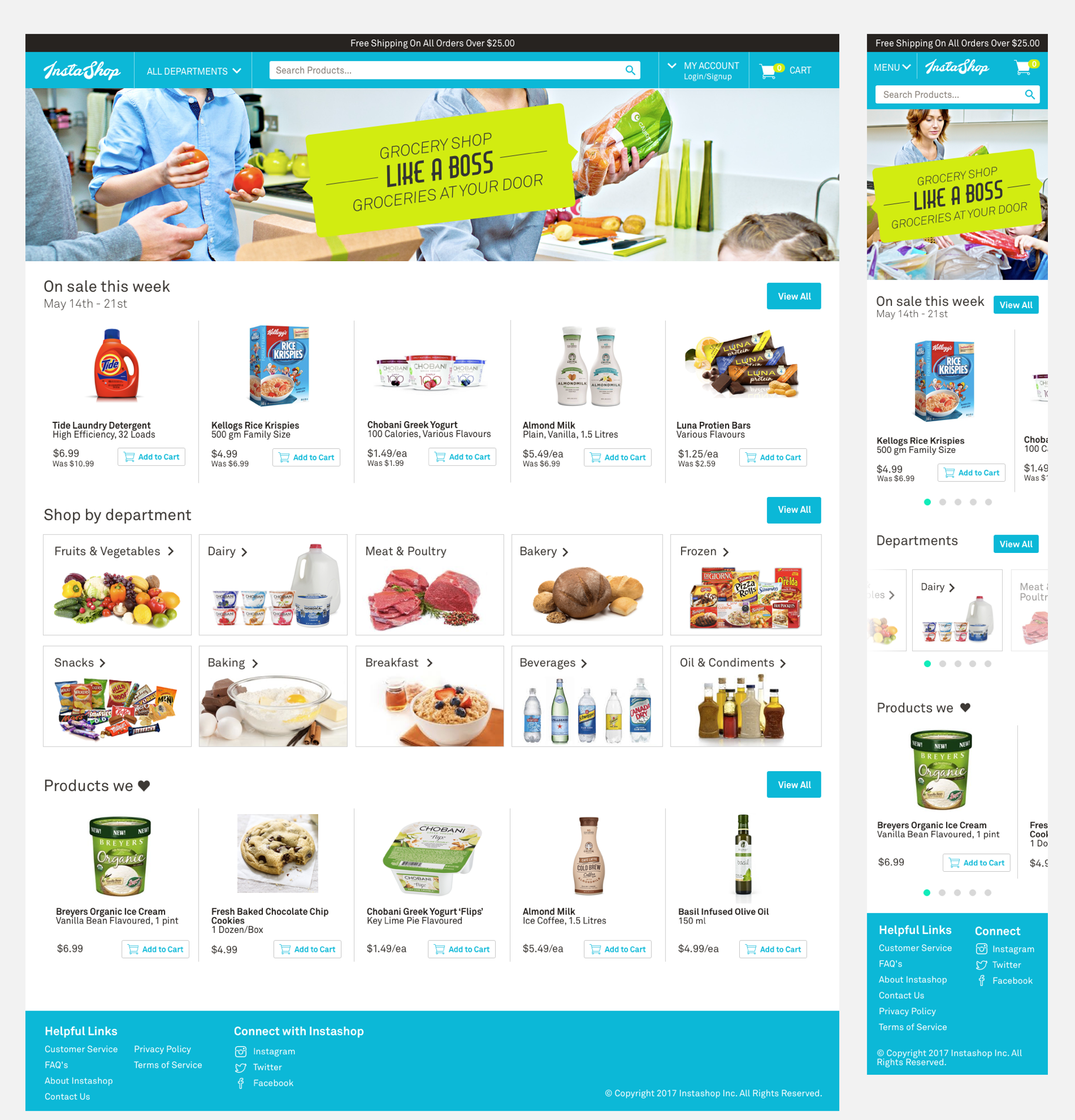
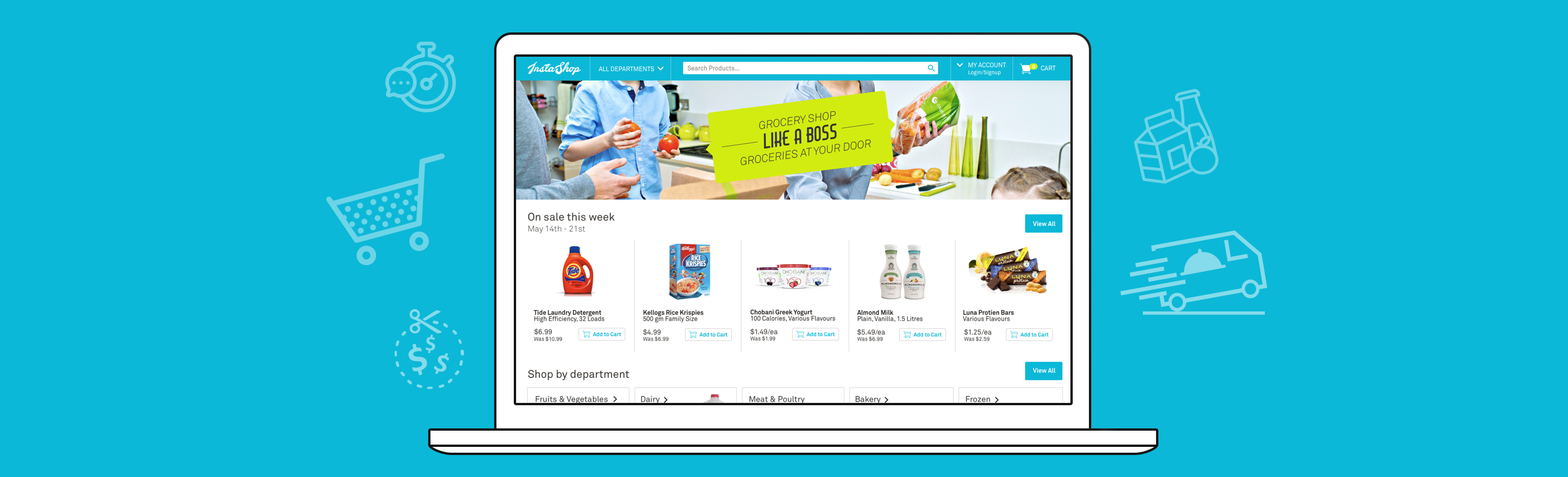
High Fidelity Concepts
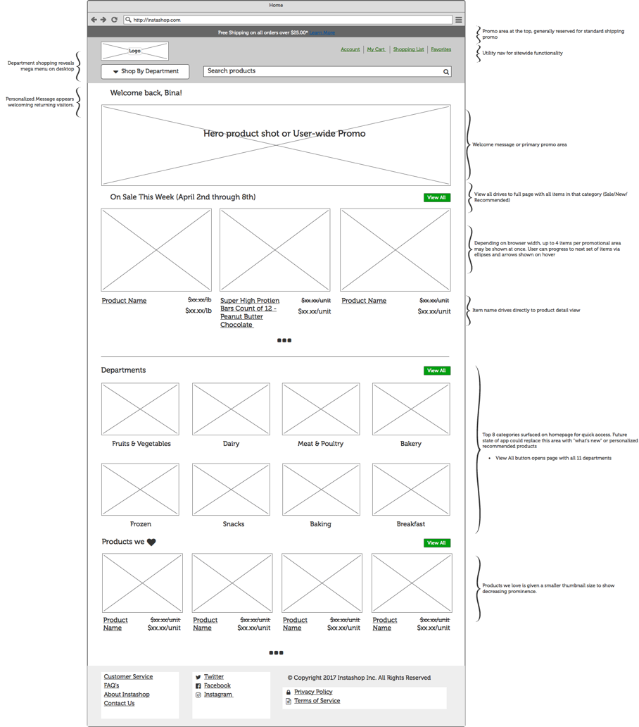
The homepage concept mimics the style of circulars commonly found at grocery stores, with an emphasis on a fresh experience that is quick and easy to navigate. Our goal was to make finding and selecting a desired product as painless as possible. Surfacing top categories, alongside promotions helped users find the products they want, rather than forcing them to wade through a page consisting of entirely promotions. The inspiration for the hero vibe is hipster meets retro 50’s wholesome family, to give the brand a memorable language and tone.