Skate Keeper App
Helping figure skaters stay on track on the ice

The Story
I took up figure skating kind of late in life (relatively speaking), and fell completely in love with it.
Along the way, I’ve met figure skaters at all levels - Kids just starting out, teenagers competing nationally and internationally, professional adults who skate on cruise ships, and a lot of adults just like me, living out their own dreams on the ice.
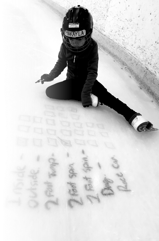
I started to notice a lot of notebooks on the ‘boards’, or kids making ticks on the boards in washable marker, tracking how many jumps they landed, whether or not their jumps were clean etc. The notebooks, and ticks on the board are really important - Shouldn’t there be an app for that? As a passion project, I set out to design a solution, in the hopes of building it out one day.
Process
Our process incorporates key validation points - via research, usability testing, and generally being in close contact with our target users to incorporate their feedback and validate our ideas and execution.

Research
While we knew anecdotally and through first hand experience that there was no existing solution, we needed to conduct some exploratory research to understand the depth of potential here, and formulate a better sense of the target market for an app like this.
To research our solution most effectively, we spoke to coaches and skaters to understand the various differences between skaters and how they approach practicing.
Our hypothesis is that a digital app for planning and tracking figure skating progress would help skaters practice better, and thereby enchance their progress.
Solutions
Using the Crazy-8s method of ideation we rapidly iterated on ideas to solve the users goals/frustrations. The outcome of the ideation were a series of features that allow users to create a list of skating elements with notes and goals for each element, log their practice notes, and track the hours spent on the ice. The planning and tracking should mimic notebook lists in the sense that it is as quick/fast and freeform as a notebook, but allow for a structured practice, with optional meta information such as goals and categories.
Concept Development
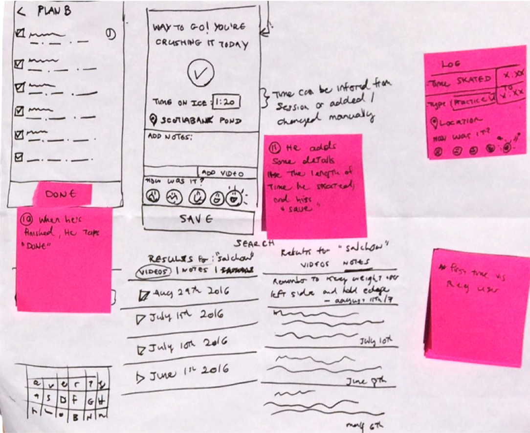
Through a series of quick, iterative sketches we drew out the app screens mapped to a user’s journey in creating and using a practice plan.
Prototyping
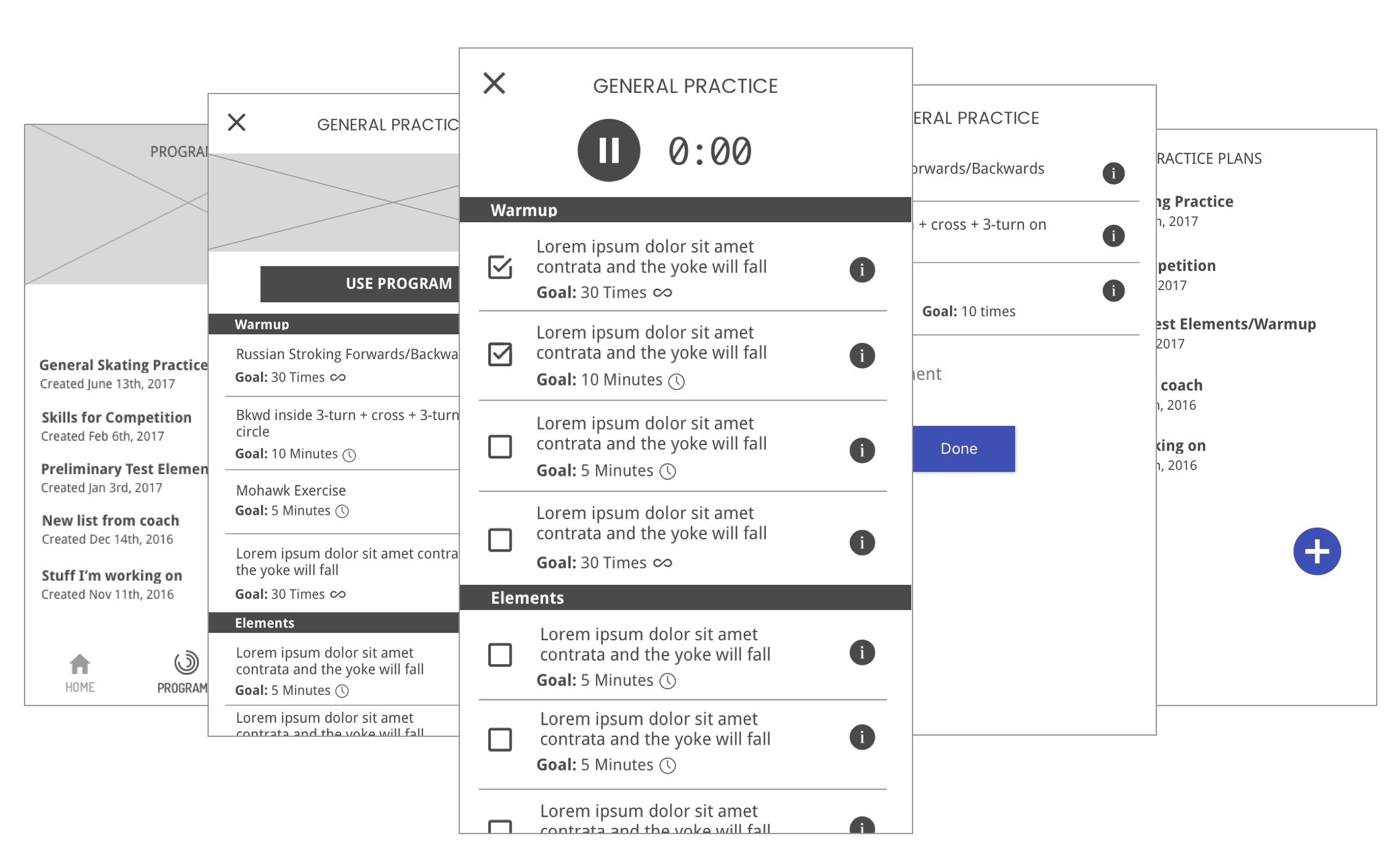
As we learned more about users needs and how they fit into an app, wireframes were created, iterated on and converted to interactive prototypes using Atomic.io.
Some of the key learnings from usabiity testing and feedback were:
- Users wanted to be able to create, save, use and re-use plans, with the notes carried over, but then edited as needed in each session they were used.
- Some users indicated that they would be unlikely to use this while on the ice, but would add notes and log their progress after the fact, against a plan.
- In future iterations, we would incorporate meta-goals - for example logging each jump, but for phase 1, users felt that an accompanying notes feature for each element would suffice.
High fidelity exploration
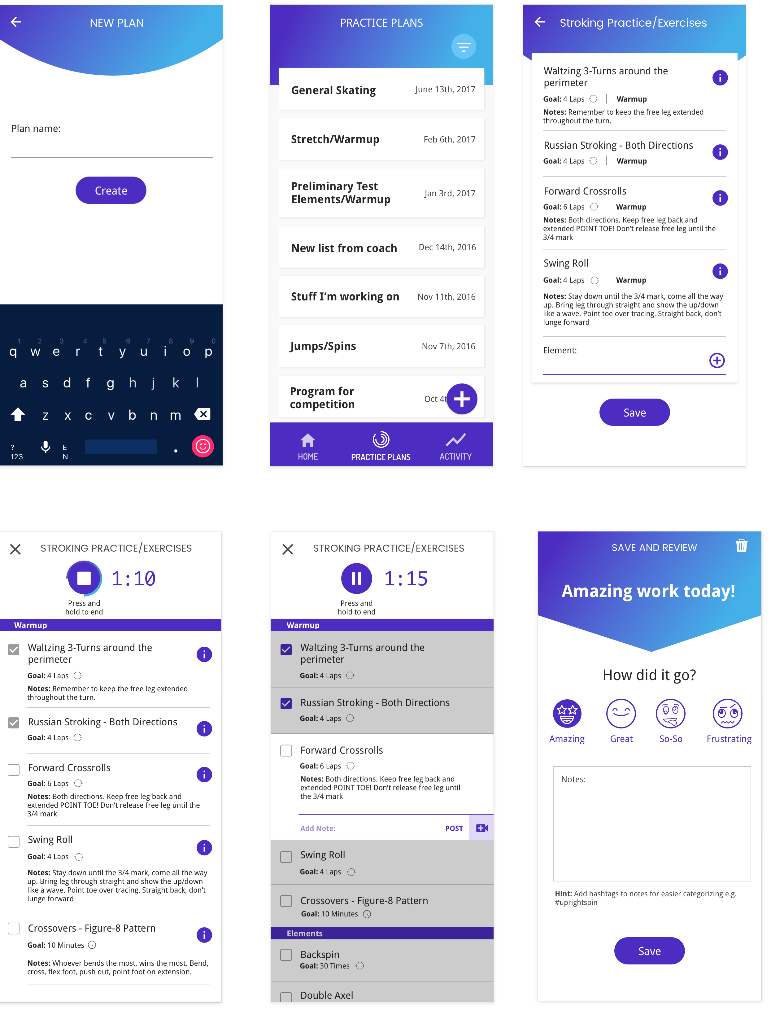
The visual language for the app uses cool blues to evoke feelings of ice/winter. The UI elements are clean and flat with subtle layering in line with Material Design guidelines. The overarching goal in the design is ease of use and without appearing too utilitarian. The app would incorporate lightly added whimsy, with natural ‘human’ humorous feedback messages that feel empathetic and motivational to skaters.
Validation
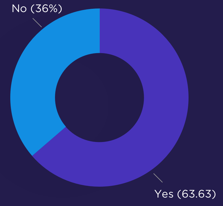
After showing the high fidelity screens to a series of users, they were asked if the app was a tool they would be interested in using. 7 out of 11 responded postively. This is shy of the 70% positive confirmation we were aiming to achieve.
Next Steps
While the results were close to our goal for validation, they didn’t quite live up to it. The steps we’ll take next will be to dig deeper into both the problem and solution to determine if we should pivot entirely, or persevere by iterating on the current solution to better match users needs.


